Color Explosion Photo Contest Winners
For this contest we invited you to submit your most jaw-dropping images featuring dramatic color for a chance to win Nuvango beautiful products that empower creative people to showcase their talent . The entries were amazing and we could not wait any longer to share the top finalists with all of you. A big thank you to guest judge Kevin Kubota. Kevin is a photographer, educator, and author with photographic roots reaching over 30 years deep. He has been featured in American Photo magazine as one of the Top 10 Wedding Photographers in the World and was named one of Nikon’s Legends Behind the Lens. He was awarded the Monte Zucker Humanitarian Award, and he is recognized as one of the Most Influential People by Shutter Magazine. His passion for educating photographers inspired KubotaImageTools.com, a resource for software, training, and creative hands-on workshops.
In Kevin Kubota's Words:
"Wow! What a tough contest to judge! I loved looking at all the beautiful, colorful, energizing images in this category. It's so interesting how the use of color, and color harmony – or discord, can affect your mood. I think looking at these images over and over is a great form of color therapy to lift your mood! When I am judging these images, I'm looking for a few key components: Impact, use of color harmony, creativity, composition, and light. Impact is generally the most important facet of a winning photograph – for any contest. The other qualities can vary in importance, but few surpass impact as a key feature of a poignant image. Boom! You gotta have Boom! Several images were very strong in some categories, but only a few stood out in all of the categories to me.
I find that images with impact will have me coming back to them over and over. Sometimes I'm not sure what it is that draws me to it – it's magnetic, or thought provoking. Maybe just extraordinarily beautiful! Often the impact is created by a brilliantly timed moment – suspended in time. Often, impact is intangible and you just get a "feeling" that won't go away. So the winner is…"

""Colorful Waterdrop" was one of the images that had me coming back over and over. It had immediate impact – with a moment frozen in time, gorgeous color palette, and a textural quality that makes you want to reach out and touch it. I love the composition, slightly offset, allowing for the patterns of repeating magenta color to balance the image. Placing the bolder color on the right counterbalances the main subject slightly left. I love how the vertical lines of color lead your eye down to the concentric patterns around the floating drop. Setup, composition, lighting, and timing for a shot like this is very tricky, so I commend the artist for pulling it all together so nicely. The magical touch, for me, is the tiny reflection from the water ball in the cyan ring up front. This is an image I'd love to have BIG on my wall!" - Kevin Kubota


""Daylily Centre" also stood out to me because of the gorgeous color palette and interesting detail in the stamen. The color harmony here is really, really beautiful and the selection of focus point works well to abstract the background colors of the flower. Compositionally it could have been improved slightly by including the entire piece of the upper stamen as you generally don't want to barely cut something off like that. It either needs to be all in, or obviously cropped out. Having an edge against another edge can be a little unsettling. This would make a wonderful, large canvas or metallic print to cheer up your living room!" - Kevin Kubota

""Rainbow Hills" was also one of my favorites and a very close runner up. It has immediate impact and makes you look twice to recognize the human forms. The interplay of the colors is really pleasing and the composition is wonderful. The photographer has used light expertly to define the forms. I think the only thing that would have made this a little stronger, to me, would be to enhance the natural "Hills" theme by using patterns from nature on the figures rather than geometric or lace-like patterns. I would have loved to see tree branches, leaves, flowers, vines, etc. on them. I still love this image, and congratulate the maker!" - Kevin Kubota


""Vodka" was also a close one for me as I love the use of the strong primary colors in a particularly balanced way. Red, green, and blue just work together so nicely and having a predominance of blue, highlighted by the touches of red and splash of green on the deck really works well. The neutral color of the earth and water surrounding the boat frame the main subject beautifully and add engaging texture. Of course, I love the vodka bottle in the foreground as I always love images with a little "secret" that you have to look harder to find. It makes the image more engaging. I think the composition is good, but possibly could have been slightly improved by including the top of the antennae in the image and bringing the red ball on the far left slightly more in to the frame. It's a great, timeless image!" - Kevin Kubota

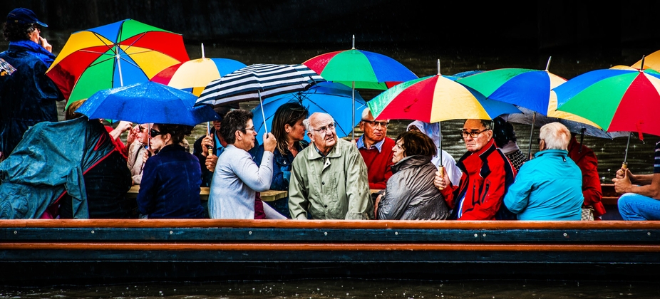
"I loved "Ship of Fools" for the terrific moment the artist captured! I love the priceless look on the central mans face as he sits umbrella-less amidst the sea of rainbow covered companions. Compositionally, it is excellent. The lines of the boat ground the image and the central character is perfectly framed. I love all the expressions on the passengers, each with their own opinion of being caught in the rain. The colorful and cheerful umbrellas are juxtaposed against the soggy faces of the passengers. It really makes you wonder how their adventure has been going so far! I'm a bit distracted by the standing man on the far left and wonder if the image would have been compositionally stronger if he wasn't there – allowing you to really focus on the central subject. On the other hand, it does add more to the story of the image, so I can see why the artist included him. Fantastic image!" - Kevin Kubota


""Flower Fields Forever" is a beautiful image that has a luminous and ethereal quality to it. The colors are peaceful and soothing – encouraging you to dream and imagine where this glorious place may be, and with whom you might be strolling hand-in-hand. Compositionally it is strong, with a nice 1/3 – 2/3 balance of sky to earth. The glow of light on the flowers in the center gives you focus, and I believe the image would not have been as effective without it. Perhaps a little surprise subject matter would have made the image a bit more engaging? " - Kevin Kubota


""Baltic Gateshead" is a wonderful image, with beautiful colors and interplay of light and shapes. Knowing that this is an art gallery, and a photograph of another artists creation, makes it a bit harder for me to give it a winning vote. We always have to be thoughtful when photographing art as the artist deserves as much credit as the photographer. The photograph was composed nicely, although with such strong geometric shapes in the stained glass, I think the vertical lines of the columns should have been straightened (either in capture or in post-processing) and centered horizontally. The post on the right is nearly vertical and slightly touching the edge of the image frame, which is generally not a good idea. I think it could have been framed slightly to the right, including a clean separation of the pillar from the image edge. The photographer did a wonderful job of capturing the mood and beauty of this artistic room creation. " - Kevin Kubota