Parallel Compositions Photo Contest Winners
Thank you to all the photographers that shared their best photos showing a composition of lines extending in the same direction in the Parallel Compositions Photo Contest with chances to win a timer remote switch, a shutter release, an IR remote control and more!
"It is always a pleasure and a privilege to judge a ViewBug contest. Like the other contests that I’ve judged for ViewBug, this contest had many outstanding works – making it difficult to decide on which images to award honors to. In a competition like this, the quality of the entries is so close that very minor flaws have major consequences. I felt I had to decide against two of my favorite images simply because the vertical perspective distortion wasn’t corrected. This is a fairly easy thing to fix. Usually a slider in Lightroom will take care of it. I decided against another image because it crowed the edges. In fact, it went all the way to the edges. Since this was mostly digital art, adding more negative space around the image would have been simple.
One thing that my apprentices in the Arcanum and my students in 256 Shades of Gray learn about me early on is that I believe that attention to detail is one of the simplest ways to elevate their photography. That is, by paying attention to the details, an image becomes better in subtle ways that we sense but may not be able to articulate. Little things like “hot spots” that draw the eye, not enough space around the image, verticals that aren’t vertical, and horizons that are crooked are simple to fix but often get overlooked. Another “trap” that many fall into is the idea that something that is in the image has to stay in the image. Several genre of photography really require us to treat photography as a recording mechanism. But, as art, we have the ability and even the right, to improve the image by removing imperfections that were in the original. For example, I decided against another image because of “unsightly” imperfections in the reflections of a stunning scene. One additional tool we often overlook is the crop tool. Step back from the emotion you have for an image and think about how the main themes of the image can be made stronger by cropping an image.
When we share an image on social media sites, all of these minor imperfections may go unnoticed. But, when trying to judge images as part of a competition, they become important because they impact the quality of the image. Elevate your image to the next level by embracing the idea that the smallest detail matters.
I suppose that, if I could, I would have rated them all as #1 but, that’s not the way contests work. All of the images were very strong with only minor details separating them. In the end, it’s as much “feeling” as it is any “quantifiable” quality." - Charles Lupica
A special thanks to friend and professional photographer Charles Lupica for his collaboration as a guest judge. International award winning photographer, author, and workshop leader. Owner / leader of the Online Photography learning community, 256 Shades of Gray™: "My images have been sold worldwide for use in magazines, newspapers, brochures and even a jigsaw puzzle, featured artist July 2013 Artist Culture Magazine."


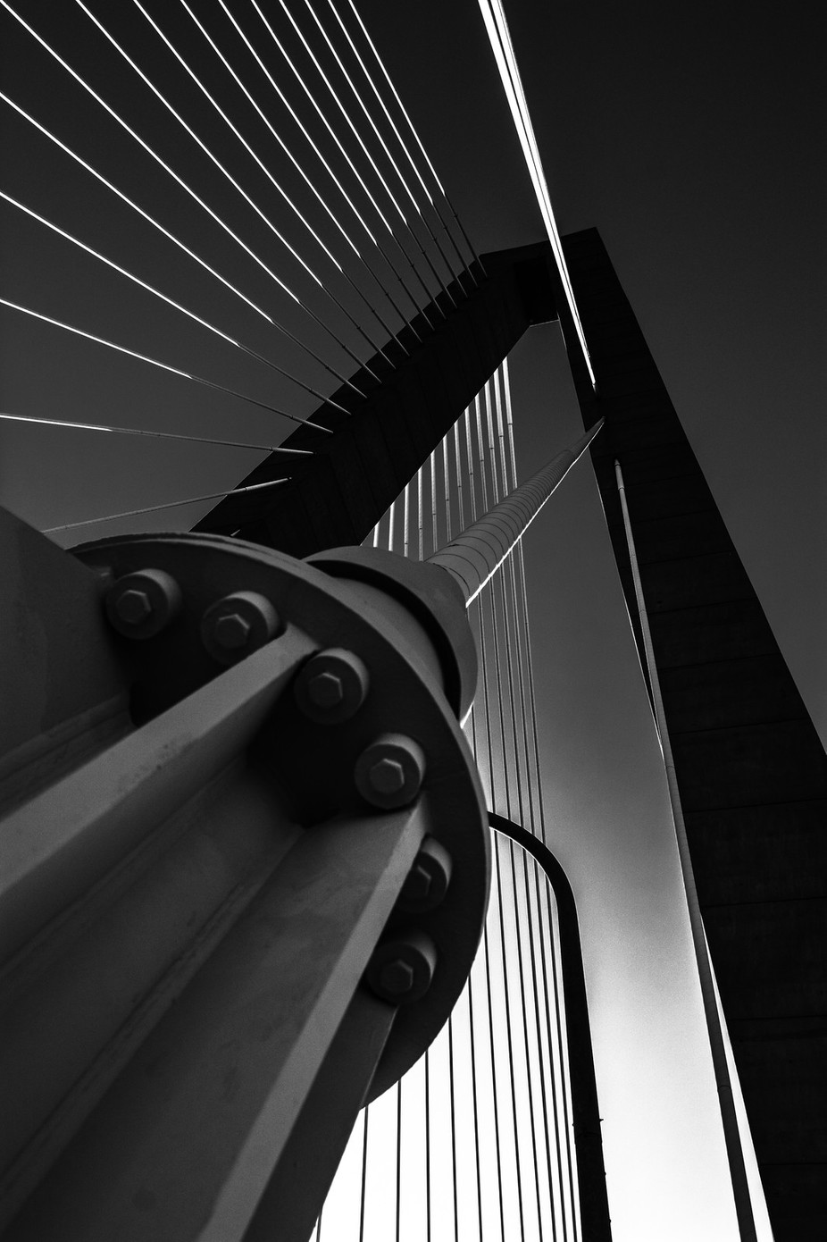
"I suppose that it’s inevitable that a person who does mostly Black and White photography would choose a B&W image for the top spot. I really like the lines of this. There is a competing dynamic that forms a triangle. If you use Lightroom, the triangle overlay is there but we seldom find a situation where it works. It works beautifully here." - Charles Lupica


"I struggled with this image. I love the pure graphic nature of it but it’s almost too perfect. If I could change anything about this image, I think I would crop a very small amount off the negative space on the right." - Charles Lupica


"I really love this image. The one, minor flaw that I would change is, I would clone out the bright light fixture in the middle of the image. It draws my eye to a place that takes away from the linear draw of the image. I would also consider toning down the bright green area to be more consistent with the pillar behind it." - Charles Lupica


"Wonderful image. Great tones and very engaging. The sun offset to the right, away from the center, provides a nice dynamic. The image looks slightly over saturated, but not too much." - Charles Lupica

"One of my favorites. I love the toning in this. The golden tones, the setting sun, and the silhouettes of the building create a strong visual impact. The reasons that I didn’t place this higher was the tight crop at the top of the building. Framing this with the top of the “mast” at the top of the frame pulls me out of the image." - Charles Lupica